Yet another 
design newsletter?

Almost Weekly is my way of exploring design, UX and accessibility with curiosity, creativity and no fluff.

Purpose / Value

icon_bulb_normal

Knowledge sharing

I focus on practical insights that designers and teams can actually use

icon_plane_normal

Creative exploration

Almost Weekly is a space to test ideas, tools and side projects outside of client work.

icon_flower_normal

Personal perspective 

It is my own voice on design and tech, shaped by real experience rather than trends.

Sample Issues

Accessiblity

Cover artwork for the issue Lovely Website Gems

Many people still misread the purpose of accessibility. They see it as a technical or legal burden, rather than an opportunity to reach more people and reduce barriers.

Instead of arguing about compliance, I prefer to visualize it. I show everyday situations: people relying on glasses, subtitles, noise cancelling, or vibrating alarms.

We all know moments of frustration, stress, or helplessness because that is what accessibility is about. Seeing real people struggle with real products changes how we design. This issue highlights some of those real life moments and why they matter.

🧏🏻 Designing For Deaf People

Dutch designer Marie van Driessche, who has been deaf since birth, gave a powerful talk at the Awwwards Conference in Amsterdam about designing for the deaf community. She shared her perspective on sign language, deaf culture, and what truly matters when creating inclusive experiences.
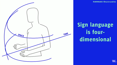
Slide artwork for the talk Designing For Deaf People

Her key message is that inclusion is not a one size fits all concept. It starts with individual needs, and others will benefit as well. Improving readability, adding subtitles, offering multimedia alternatives, and providing flexible contact options all help create better experiences for everyone.
Cover artwork for the issue Lovely Website Gems

🌈🦋 Living with ADHD

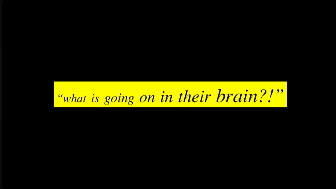
Jessica McCabe describes living with ADHD as having your brain switch between 38 channels while someone else holds the remote. At 32, ADHD brought her to a breaking point; two years later, she was thriving. In her TEDx talk, she shares what it truly feels like to live with ADHD and how she learned to work with her brain instead of against it.

Frame from Jessica McCabe’s ADHD talk

As Jessica explains, ADHD is not a lack of attention but a challenge in regulating it. It affects planning, focus, and emotions, yet it also brings creativity, quick thinking, and strong problem solving skills. Her talk sheds light on both the struggles and the strengths that come with ADHD.

🔢 Living with dyscalculia

Many people say they are bad with numbers, but dyscalculia is something very different. In her personal story, Laura Parker shares what it means to live with this condition and how it affects daily life.

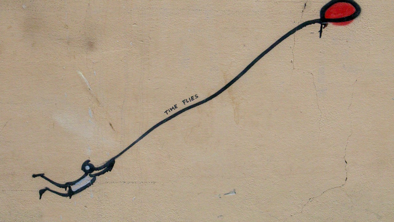
Illustration of a stick figure trying to keep a red balloon that is flying away. Text: time flies.

Dyscalculia makes it hard to understand and work with numbers, which impacts tasks like handling money, reading data, or judging distance.

To help others design and communicate more clearly, Laura created a practical guide for presenting numbers and data in accessible ways. A must read for anyone creating content that involves numbers.

🌀 Accessibility For Vestibular Disorders

Vestibular disorders are often overlooked because they are invisible. They can cause vertigo, nausea, balance problems, and headaches, similar to seasickness but lasting much longer. Developer Facundo Corradini experienced a severe case that lasted over a month and completely changed how he thought about accessibility.

A gentle landscape photo used as a section illustration

When his symptoms eased, he began experimenting with design solutions that reduce discomfort. His recommendations include larger target sizes, less motion, and options to control animations. As with most accessibility improvements, these changes not only support people with vestibular disorders but make digital experiences better for everyone.

🎨 What It’s Like To Be Colorblind?

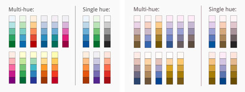
For many designers, colorblindness is just another item on the accessibility checklist. To make it more tangible, Lisa Charlotte Muth spoke with ten people about their experiences living with colorblindness, most of whom are green blind, the most common form.

Color palettes and charts used in an article about colorblindness

Their stories reveal how colorblindness affects daily life and data interpretation. Lisa combines the perspectives of users and designers, including interviews with two colorblind cartographers and the CEO of Datawrapper, to show how color perception shapes the way we design and communicate visual information.

Website Inspiration

Cover artwork for the issue Lovely Website Gems

Hi, this week comes with a little makeover. Both the Almost Weekly website and the newsletter got a fresh coat of paint. More considered, bolder, and hopefully still easy on the eyes. Just like a good redesign should be. Love to hear your feedback!

With that, let’s look at websites that feel more like games than scroll-and-leave pages. Some lean into playful branding, others into immersive visuals, and a few even become little tools of their own. All of them remind us that the web is not only about speed and conversion, it is also about experience.

🍽️ Palmer Dinnerware

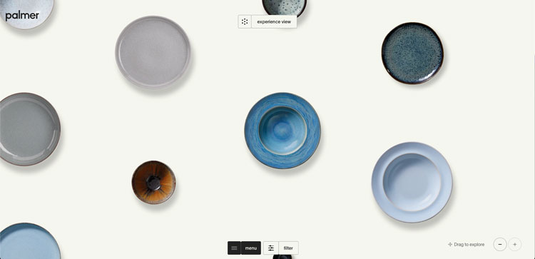
Imagine a store that makes developers sigh and designers smile at the same time. Palmer Dinnerware by Uncommon Studio is exactly that. It doesn’t care about minimal grids or fast transactional checkouts – instead it puts beauty and interaction front and center.

Palmer Dinnerware website preview

The real joy lies in how playfully crafted each element feels. Typography, layout, and motion create a tactile feel that turns a simple product site into an experience.

💻 Posthog OS

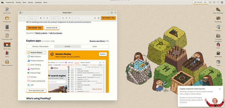
Posthog just launched a website that doesn’t feel like a website at all. It behaves like an operating system, complete with draggable windows, a cheeky CD icon, and even an old visitor counter at the bottom.

Posthog OS interface preview

At first it feels like too much, but then the concept clicks. Posthog is literally an operating system for engineers and product teams. Wrapping the brand in this OS aesthetic makes perfect sense and shows that when experience matches product, fun concepts can become effective communication.

🚗 Q Refinish

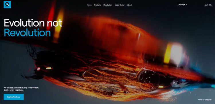
Q Refinish is not your average car paint supplier. From the first second you’re pulled in by a Lamborghini drifting through particles on the homepage. Hover states trigger slick 3D videos. Even the tiniest paint bottle looks like a luxury item.

Q Refinish website preview

The real achievement is balance. Despite all the polish, the site still functions as a store. You can explore products and dive into details without losing the high-end feel. Artemii Lebedev created a site that proves product-first and premium design can live together beautifully.

📐 Dimensions

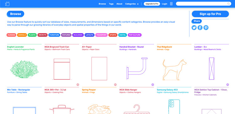
Sometimes you don’t need a spectacle – you just need the right numbers. Dimensions is a reference database for everyday measurements. Whether it’s animals, vehicles, furniture, or even pop culture characters, you can find accurate sizes and proportions.

Dimensions website screenshot

For designers, this is a little lifesaver. Want to create an illustration that feels real? Or need to check how tall a door is compared to a person? Dimensions helps put things in perspective.

🗺️ Hoodmaps

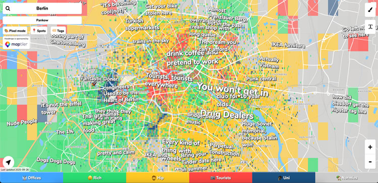
Exploring a new city isn’t just about streets and landmarks. It’s about people, vibes, and unwritten rules. Hoodmaps lets you see a city through its communities.

Hoodmaps website interface

Users paint areas with categories like hipsters, tourists, or students, adding small tags and insights others can vote on. The result is a playful, crowdsourced layer on top of traditional maps. It’s a side project by Pieter Levels that now covers thousands of cities – a fun, unpolished way to see how neighborhoods feel.

aw_thumb_16-9

Subscribe to Almost Weekly.

Short reads on design, UX, performance accessibility. No spam, just ideas worth sharing.

NF191881

Want the full picture?

You can download my complete CV in English and German as a two-page PDF including roles, projects, and education.

Misc

Social

2025

Kay Kazemi